

Modernizing the U.S. Tax Court’s public website
Transitioning from a legacy platform to a secure, scalable, user-friendly CMS

Challenge
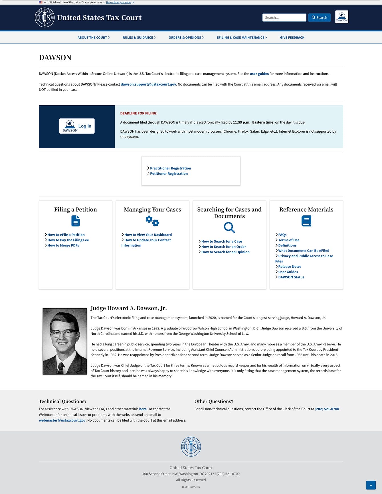
The U.S. Tax Court’s public website was running on an outdated platform (RapidWeaver). It was not cloud-based and lacked the flexibility and scalability required to support modern digital services. Maintaining the legacy system required significant effort during migration planning, creating operational risk, and slowing modernization efforts.
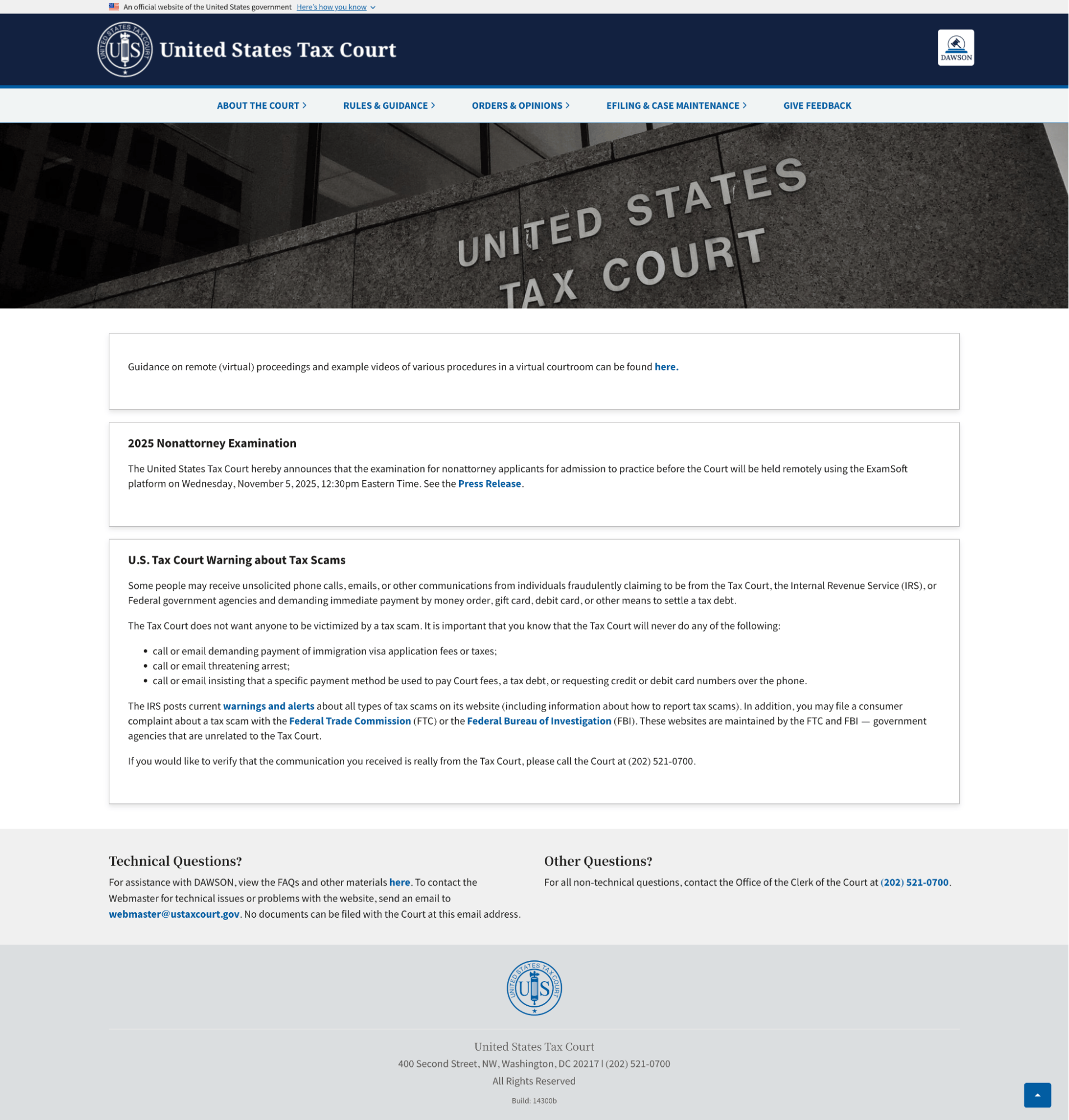
For users, the limitations were clear. The site’s outdated design and constrained functionality made it difficult to navigate essential court resources. Tasks that should have been simple were unnecessarily frustrating. The Court needed a website that was intuitive, accessible, and aligned with modern usability standards.
To address this, the project required a dual-track strategy:
- Stabilize and maintain the legacy website to ensure uninterrupted public access.
- Execute a long-term migration to Wagtail CMS to improve performance, content management, and user experience.
Approach
To meet these needs, the team implemented two complementary workstreams:
- A technical modernization strategy to build a secure, scalable platform
- A UX-driven redesign to improve clarity, accessibility, and usability.
Technical approach
The U.S. Tax Court website is engineered as a modern, production-ready digital platform that balances editorial flexibility with strict federal requirements for security, performance, and reliability. Built on a robust Django/Wagtail foundation, this federal CMS migration to Wagtail ensured the system gives court staff an intuitive, low-friction content management experience while ensuring that updates, such as news, notices, alerts, and navigation changes, can all be published quickly and safely. The supporting AWS cloud architecture reinforces this agility by providing resilient, auto-scaling compute resources, managed databases, and globally distributed caching. Together, these components minimize downtime, optimize load handling during traffic spikes, and guarantee rapid content delivery regardless of location, creating a stable backbone that supports long-term modernization.
Behind the scenes, the infrastructure emphasizes maintainability and long-term sustainability. Infrastructure-as-code ensures every environment is consistently deployed, allowing the team to evolve the platform without operational risk. Automated monitoring, logging, and alerting enable proactive issue detection, while tightly scoped IAM roles, encryption, and isolated networks protect sensitive operations. Continuous integration and testing pipelines enforce high code quality and safeguard releases, ensuring each iteration moves smoothly from development to production. This architecture not only supports a more secure and accessible user experience on the front end but also equips the Court with a future-proof framework capable of accommodating new features and enhancements with confidence, helping the technical foundation grow in step with user and operational needs.
UX approach
The UX team began the redesign process with a comprehensive heuristic evaluation of the USTC website. This included a readability analysis to assess the comprehension level required for the site’s text and content, a series of card sorting and tree testing exercises to understand how petitioners and court employees organized information, and finally, an A/B test comparing the existing homepage with a new wireframe informed by deeper usability insights from previous studies.
The research highlighted some major usability issues that needed to be addressed in the redesign, particularly navigational challenges, ambiguous naming conventions, and persistent layout/readability issues.
From here, the UX team developed a series of high-fidelity mockups that directly utilized the insights brought forward from the research. Guided by analyzing Google Analytics data, our UX team focused on the top-most visited pages to ensure the redesign elevated the content and pathways users depended on most.
These wireframes focused on utilizing easy-to-read plain language, streamlined navigation, simplified and intuitive layouts, and a new information architecture that better aligned with users’ mental models and overall expectations for accessible government websites and user-centered designs.
The updated homepage design was then presented to the court for final approval. The UX team shared research findings and the new design with court staff and senior judges, emphasizing how data and human-centered design principles shaped and validated each design decision. The Court was eager to move ahead with the new homepage design, setting the foundation for a more modern and accessible digital experience.
Outcomes
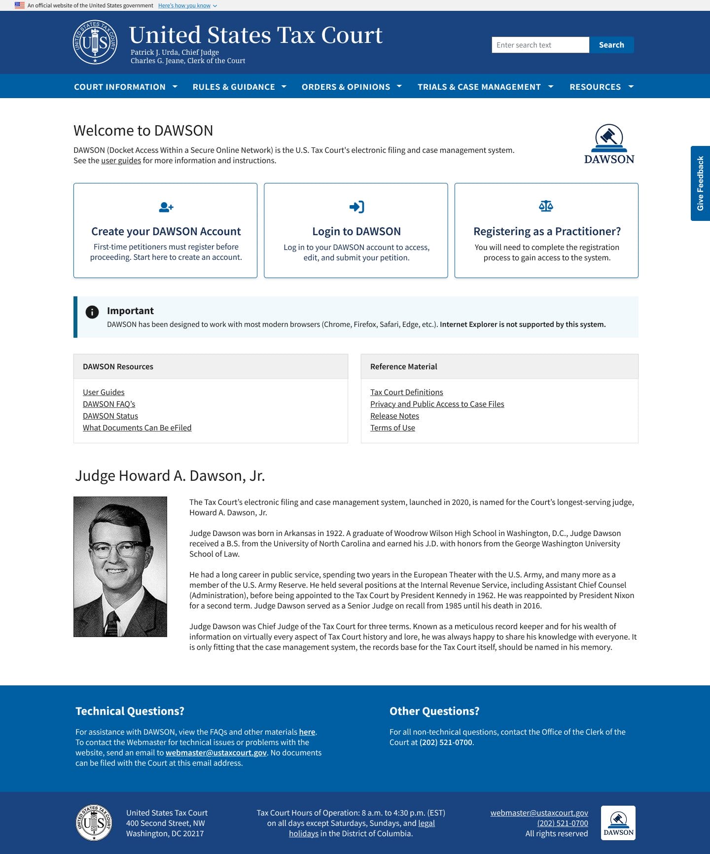
The redesign marks a major step forward, delivering a more efficient and user-focused experience through several targeted improvements that meaningfully transform how the public interacts with the U.S. Tax Court online.
Streamlined navigation now allows users to quickly access high-traffic areas via intuitive quick-access tiles. A dedicated news and notices section ensures that important Court updates are always timely and visible, while priority alerts highlight urgent announcements so nothing critical is missed, a major win for transparency and public trust.
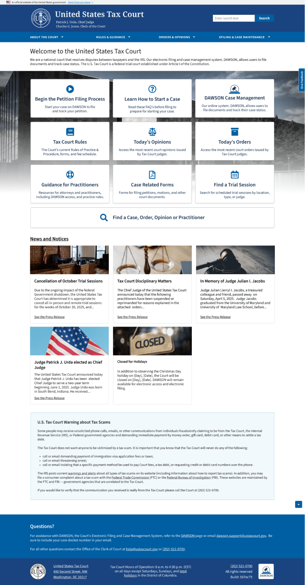
All UI components have been upgraded to the official USWDS design pattern library, bringing the site in line with modern federal digital standards. Users can now access direct support through a new help contact, enhancing responsiveness and assistance, and making it easier than ever for petitioners to get clarity when they need it.
Finally, security and accessibility upgrades behind the scenes provide a safer, more inclusive digital experience for all users, reinforcing the Court’s commitment to a modern, equitable public service. What began as a legacy challenge has grown into a shared, measurable step forward in government website modernization, an outcome central to this government website modernization case study.
Ready to change the way you’re doing business?
Contact us to talk about how Flexion can help your organization drive efficiency, optimize costs, and achieve your technology goals!
